Microsoft Office now puts even more self-serve business intelligence capabilities at your fingertips, thanks to a round of significant updates announced in a Data Platform Insider blog post on Wednesday. The updates beef up the data analysis and visualization features of online service Power BI for Office 365, as well as a couple of key complimentary add-ins for Excel, all of which are currently available in preview versions.
Here’s a look at what’s new:
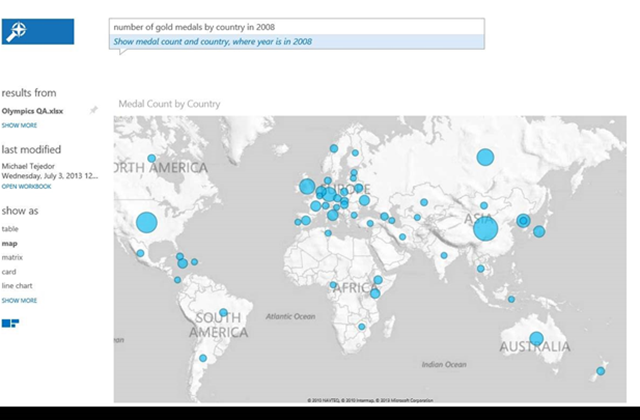
Power BI now includes a new feature called Q&A that lets users instantly create slick-looking interactive charts and graphs just by entering a query using everyday language. Here’s an example of what Q&A can do with a simple search on a spreadsheet:
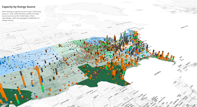
Power Map (the Excel add-in formerly known as GeoFlow) is a popular tool for visualizing geographic and temporal data in 3D, and the latest version lets you create and share interactive video “tours” through your data. Conveniently, the videos work well on a variety of mobile, tablet, desktop and HD devices. The Power Map add-in also now includes region-based visualization that will color-code by geopolitical area (i.e. zip code, county, state, country/region). You can download the latest version of Power Map here, and to learn more about how it was developed, check out this post on Inside Microsoft Research.
Power Map
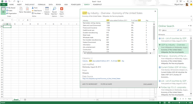
Power Query is another Excel add-in, this one for mashing up existing data sets, and it’s been refreshed with an improved search experience, simplified data importing for SQL Server/Windows Azure SQL Database, more filter capabilities and the addition of new datasets including data.gov and the Windows Azure Marketplace.
Power Query
Used together or separately, the business intelligence capabilities of Power BI for Office 365 put the power of big data in the hands of a billion users worldwide, making data analysis more engaging and impactful. Read more in this post on the Data Platform Insider Blog.
Steve Wiens
Microsoft News Center Staff


