On my quest to find stories at Microsoft, I’ve come across few better storytellers than Greg Hitchcock. Having worked at Microsoft for 25 years, he has a rich back catalogue to pull from.
Greg started in our product support group, working on products like Microsoft BASIC and Microsoft COBOL – an unnecessary reminder of my own age as COBOL was the first programming language I learned at school. Greg’s schooling was undertaken locally at the University of Washington where he studied Geography with a deep focus on computer cartography. He also immersed himself in to computer science, which ultimately led him to meet a Microsoft programmer and his first job at the company. Twenty five years on, Greg has seen the campus and company grow from a few small buildings to the wide expanse you hopefully saw last week on the blog. He now resides in the beautiful building 85 and works on our font technology as Partner Development Lead in the Advanced Reading Technologies Group. I came to meet Greg as he saw the story I wrote a while back regarding the Verdana typeface being added to the permanent collection at New York’s Museum of Modern Art.
That felt like a good place to begin my discussion with Greg – what’s the difference between a font and a typeface I asked?
“Historically, a font referred to a single size of a typeface so the 16pt version would be a different font to a 12pt version. A typeface is the whole collection of sizes. Before scalable fonts, we had bitmap fonts and the terminology made sense as a font was at a particular size determined by the bitmap. With scalable fonts, the distinction really disappeared”
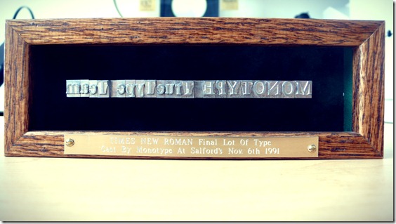
As an example, Greg handed me the wooden case below that contains the final lot of metal type for Times New Roman, courtesy of Monotype at Salford’s in England. This he explained is what was traditionally known as a font – a set of characters at a certain size. It was one of many artifacts in Greg’s office that reflected his world of work and his journey in Microsoft.
The image at the top of this post may look familiar too – it’s the last two characters, in the form of a ligature, of the Microsoft logo, and Greg being a font guy noticed this on the floor during a building refurb and figured it’d make a nice addition to his collection. Here are a few other items from that collection.
I then asked Greg a question I suspect he’s been asked a lot. What is your favorite font?
“It’s a hard question to answer. We’ve done research in this area and found that you really need fonts that match the tone and emotion of what’s being written. We have a font called Comic Sans and it gets rough treatment but if you’re doing something humorous or kids oriented it’s a great font for that. If you’re doing something serious it’s a terrible font to use. The emotions of the typeface need to match what’s being written. Then you have text faces and display faces. Text faces get used in books and magazine. Display faces are used less for long reading and more for things like advertisements. You may see a font and immediately think 1970’s – and if you see something modern with that, there’s a disconnect”
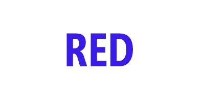
We paused at this point as Greg dashed out of his office and came back with something behind his back. He told me I was about to undergo the Stroop Test. He then revealed a white piece of card with the following written on it and asked me to quickly tell me the color of the font.
We’ve all seen these visual tests at times but it made the point – congruency is a vital component of our ability to read accurately and reliably. When the card was flashed at me I knew I’d paused while my brain undertook a cognitive mechanism known as directed attention – forcing myself to inhibit one response in order to give the correct response. I asked Greg about the other test I have seen a lot on the Internet in recent years – our ability to read text even though words are jumbled within it. You likely read that last sentence perfectly well, despite the errors. Greg acknowledged that but added:
“Sure, we can do that for a few lines of jumbled text but try it for a few paragraphs, pages or even a book and your speed of reading and comprehension will slow down dramatically”
At that point we both realized Greg hadn’t really answered the question regarding his favorite font:
“sometimes I have to be pragmatic and use a face I know people will be able to read easily. Verdana is a great font for this – our studies have shown it’s one of the most legible fonts we’ve ever done. If I’m doing notes for a talk that are easy to glance at quickly then Verdana is great. I love Georgia, I love Palatino Linotype. Of the Clear Type fonts we did for Office, I love Constantia. I also love Gabriola…it’s a beautiful flowing type face”
…at which point we paused again as Greg showed me Gabriola. He started with the standard Gabriola font which looks like this – very elegant I thought.
.
…and then he showed me something I’ve never seen before – advanced font settings and something called stylistic sets. After setting this to feature 6, our text changed to what you see below
…what was even more impressive was the way the style of this font dynamically changes as you type with swooshes and twists (I know they’re not the right terms and Greg will correct me in the comments I’m sure!).
Our time was quickly up and I realize I am now becoming a total font geek. I left Greg’s office with a set of reading material (on paper I may add) and I’ll be back to chat with Greg as he has amazing stories.
However, I realized I’d left without asking what keeps Greg at Microsoft after 25 years. He responded in his chosen font for email (Constantia) saying:
- I work with some of the greatest people, especially those on my team.
- I learn something new almost every day.
- My job involves a great balance between engineering, art, and science.
- The work that my team does has an impact around the world.
- I can easily explain to my mom what I do (it would be much harder to explain memory managers or TCP/IP stacks!)
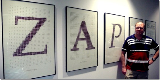
Oh, and it’d be remiss of me not to include a photo of Greg – alongside one of the projects he worked on with Hermann Zapf. The photo doesn’t do justice to the posters which I’ll share high-res versions of shortly.


