Justin Rao and Jake Hofman coordinate the Data Science Summer School program, hosted and sponsored by Microsoft Research. Each year, dedicated students spend their summer learning how to conduct research thanks to a network of researchers, mentors, and advisors. All of the course materials are openly and freely available on Github.
Tonight, we’re celebrating the program’s second class. Last year’s students researched questions about racial profiling in New York City and how to optimize the city’s bikeshare system.
Subways
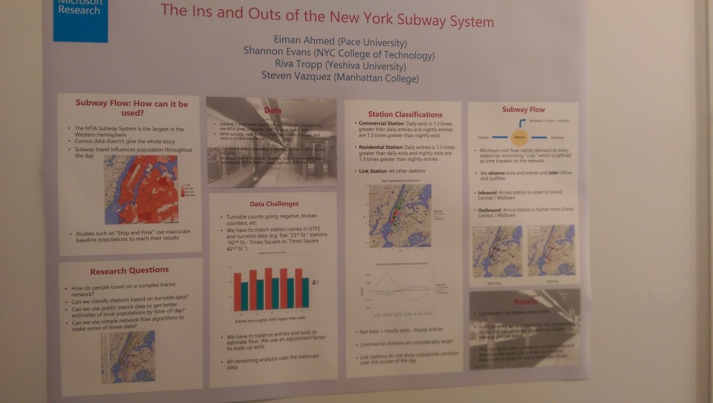
The first team, consisting of Eiman, Shannon, Riva, and Steven, studied the New York City subway system. They were interested in how people travel on complex transit networks, and classifying stations based on turnstile data. The system’s 468 stations serve approximately 6 million trips per weekday. The team took data from the MTA’s General Transit Feed Specification data and MTA turnstile data, but had to exclude PATH, LIRR, NJT, and Staten Island Railroad systems due to incomplete data.
There are 30% more entries than exits in the data due to New Yorkers’ habit of using the more accessible emergency exit door. New Yorkers also travel less on Mondays and Fridays, as well as holidays and during major snowstorms. The data required significant cleaning to balance entries and exits and match station names across the datasets.
Different stations serve different purposes in the city. The team categorized over 400 subway stations as commercial stations, residential stations, or link stations, based on the ratio of daytime to nighttime entries and exits. Residential stations serve roughly 1,000 fewer entries per hour (~400 per hour) than commercial stations (~1,500 per hour). Grand Central alone serves over 188,000 daily exits. As you might guess, the commercial stations serve Manhattan south of 59th Street, while residential stations cover the rest of the city, with a few exceptions for military bases, car dealerships, and other outliers.
Next, the team constructed a network graph to visualize the flow of activity through the stations. Nodes were train stations, edges were rail links between adjacent stations, and the cost is the time it takes to travel from one station to another based on schedules. The resulting adjacency matrix is a rat’s nest (sorry) of stations, improved by adding the stations’ geocoordinates.
One finding is that 14th Street Union Square has 10 neighboring adjacent stations, while Times Square, the most trafficked station, has only 7.
The team estimated demand of inflow and outflow, and computed minimum cost flow, where demand is satisfied while minimizing the previously defined cost. They chose Grand Central Station as the center of the visualization. The algorithm identifies high flow corridors. In the mornings, the flow is generally inbound to Grand Central, with the exception of flow down to Lower Manhattan.
Next, they wanted to model population flow. US Census data only shows residential population, which wouldn’t work for New York’s immense number of commuters. Combined with the commuter data, we can watch Census tracts empty or swell throughout the day based on commuting patterns. The team suggests applications such as correcting stop and frisk activity for an area’s current population, or studying disease spread in epidemiology.
Q: Has anything you’ve learned change how you use the subway?
A: “I definitely don’t use the [emergency] exit doors anymore”.
“I don’t know if Midtown is fire-safe”.
Schools
The second data science team sought to understand the relationship between housing values and the quality of the school district in which they’re situated. It’s comprised of Glenda, Thomas, Nikki, and Anastassiya.
The New York City school system is the largest in the country, with over 1 million students. It has some of the best schools, and some of the worst, depending where you live. The team looked at test scores and plotted it relative to the rest of the state. The result is a huge disparity, between boroughs like the Bronx and Queens, and within boroughs like Manhattan. They took shapefiles and plotted school performance on a map of New York by color.
PS111 performed worse than 60% of all schools in the state, where as PS59 performed better than 99.2% of all state elementary schools. They are a ten minute walk from one another on 53rd and 56th streets.
This is where school district boundaries can make or break your child’s education. Park Slope recently redrew their lines, stoking parents’ anxieties.
The team compared high-performing school zones to housing values. In an ideal experiment, they’d sell identical apartments in two different school districts. Instead the looked at historical sales value data by scraping StreetEasy, a major NYC-area real estate website. The data wasn’t perfect — apparently you can have a negative number of bedrooms and bathrooms.
They wrote a Python script to geocode the addresses with the NYC GeoClient API. They computed and displayed the latitude, longitude, school, and price per square foot for each home. 40,000 distinct sales produced 10,000 sales with complete data mappable to known school zones.
Apartment prices alone illustrate huge disparities in New York: $110 per square foot in Woodlawn, Bronx vs. $3,393 per square foot around Central Park South. When plotted against school performance, there’s a correlation between price and competitive schools, but the relationship is conflated by other factors like neighborhood quality and location. We can’t confidently say that price per square foot increases only because of school quality.
So how do we isolate the school zone premium? If we had infinite data, we’d simply subtract the average sale price in neighboring zones from the average sale price in the school zone. With limited data, the team had to build a model to estimate, and fit a linear model to predict sale price per square foot. They used regularization to select important features and avoid unreliable estimates of sales in the given areas. They took into account the number of bedrooms, bathrooms, demographics, test scores, and neighborhood, as well as the interactions between the number of bedrooms and the school (to capture families vs. studios).
The median absolute deviation for all boroughs was $103 per square foot, but it varied by borough: $48.99 in the Bronx and $138.48 in Manhattan. The model accurately captures average home price within each school zone.
The team zoomed in on Park Slope to identify school-based premiums. They found a premium of $84 per square foot for residencies in PS 321’s school district vs. those in PS 282, despite PS 282 being closer to the Atlantic Ave subway hub. Repeating the same procedure in each school district, they find that you do pay less to live in a school district with poorer test scores.
The result? New York City’s schools demonstrate extreme inequality, often over small geographic areas.
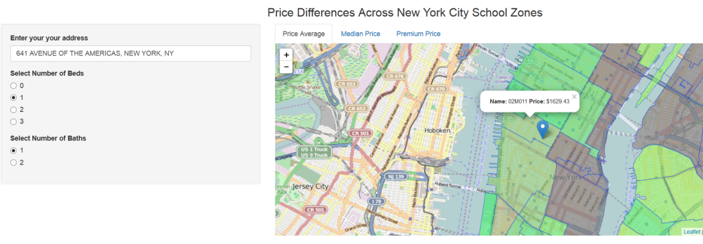
The information is compelling, but static, so the team built an interactive app where you can enter your address and number of bedrooms and bathrooms to see the price average, median price, and premium price (positive or negative) in each of the city’s school zones:


