

Here in the Bay Area, we’re proud to have many teams within Microsoft that utilize the region’s strength in technology and innovation to drive forward Microsoft’s mission to empower every person and every organization on the planet to achieve more.
The local Outlook Mobile team, which is based in San Francisco, leads the charge in building and improving Outlook Mobile. Their user-driven, data informed workflow helps them create impactful, customer-inspired growth each day. Recently, Tali Roth, head of product for Outlook for Android, wrote about Outlook Mobile’s unique work in a post originally published on Medium. Read on below to learn how this team is driven to succeed.
A lot of teams say that they are data-driven. On Outlook mobile, we say we’re user-driven, data informed. What’s the difference?
“Data Driven” has become a bit of a tech industry buzzword. From small startups to the largest tech companies, teams are applying this data-driven mantra to their product decisions. But what if data isn’t enough? What do you need to do to truly win user love?
On the Outlook mobile team, we’ve started using a new mantra. User Driven, Data Informed. We still look at data all the time. We roll out every feature gradually across our user base and measure its impact. We run scorecards to see if we’re affecting core
user metrics like how many people are reading or writing emails, and we look at specific metrics we expect to improve with a given feature (more calendar usage? better search success?) to see if we’ve succeeded. When we spot an issue, we quickly turn around a fix.
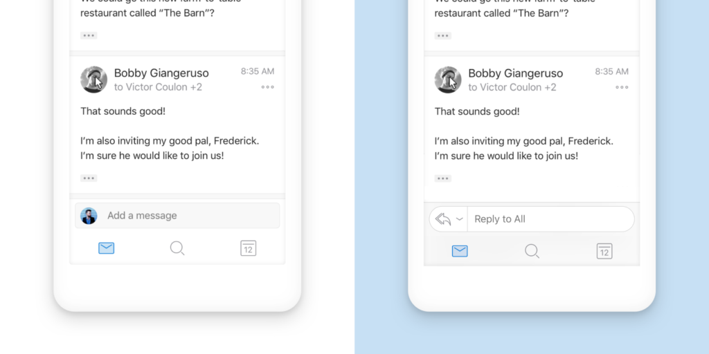
For example, when we shipped our new conversation experience on Outlook for iOS, we got lots of positive feedback from articles and no spike in our help requests. However, we noticed data showed that replies had gone down, and a large percentage of people were using a secondary control to reply rather than the new quick reply box we’d designed. The product manager, designer, and engineer on the feature quickly jumped in and clarified the language we used in the reply box, we added extra shading to give the box more prominence, and swapped the avatar of the person replying for a drop-down control to make it obvious how to switch between reply all, reply, and forward (see before and after photo below). Our data showed those changes made an immediate impact, so when we brought that feature to Outlook for Android, we based our design on that updated model.
So we care about data — but that’s just part of the story. As shown in the example above, data is great for optimizing an experience and hitting a local maximum. However, without understanding the user need, data can’t tell you where to go, and it can even lead you astray. If you’re just focused on lifting a certain metric without listening to users, you can end up building an experience that feels wrong or optimizes for the wrong things. For example, if we wanted to get people to read more emails, we could download all emails and open the first email in the message list automatically as soon as someone launched the app. But that wouldn’t necessarily account for what users want — it might not open the right email, it might download something over their limited data bandwidth that they didn’t want to open to begin with, it might ultimately slow them down.
More importantly, it’s impossible to measure user love with numbers. It’s easy to make the mistake of thinking engagement or retention equals love, but this falls short when your app is all about getting users in and out and back to their lives. A good example of this is our Do Not Disturb mode — how would you measure success or love for this feature? Someone who has Do Not Disturb mode on could be frustrated with the app because it’s too chatty, or satisfied because it helps them control the distractions and only see notifications when they want them. The only way to know we’re doing the right thing with these types of features is to be tuned into our users directly — which is a type of data, but not the kind that folks normally mean.
So how do we figure out what our users want, and more importantly get to the why of what they’re looking for? How do we ensure that we are user-driven?
We listen to our customers in lots of ways — we use UserVoice, which lets users vote on features they’re looking for. We read hundreds of app reviews and look at trends weekly, we do Net Promoter surveys to get more feedback from folks using the app, we’re active on Twitter, and we speak at conferenceslike Ignite. We have calls and meetings with different enterprise customers every week to answer questions and talk hear their feedback on our roadmaps, and do in-person user studies with consumers every month to try out our new ideas. (At the end of the day it turns out that enterprise and consumer customers are all just people first and foremost, and though they have different features they need day to day, they all want the same thing when it comes to performance and craftsmanship.)
We also put ourselves in the shoes of our users by dogfooding our own products — every single person on the team uses a beta version of the app to do their day-to-day job, and because they’re all mobile engineers, designers, and product managers, they’re often the ones with the most critical feedback! All employees at Microsoft help us out here too by running early builds of the app and sharing feedback in the hallways, at the water cooler, and on internal distribution lists.
That said, we know our team can’t represent the experiences of all our users, so from the beginning Outlook mobile has had support built into the app. We have a fantastic support team that sits side by side with our engineers and is committed to helping solve any user issues. Not only does this ensure that we can take what may be a broken experience for users and turn it around, but it also means that the product managers, engineers, and designers have a direct line to customers to understand what’s not working well and what they want us to do better — and they’re empowered to do something about it.
And when we’re talking to users, we’re listening — to hear the “why” behind their requests. Often we’ll hear a specific feature request from someone — for example: give me the ability to just see notifications from my favorite people, or: let me set the sync interval manually. It would be easy to just build features based on a list of requests, but instead we dig in to understand and learn that what they’re really looking for are ways to reduce stress, focus, and show up as their best self. When we can focus on that rather than just building a feature and measuring whether users are clicking on it, we can really help people connect, organize, and get things done with Outlook mobile.
If your team connects with your users in a unique way, please let me know in the comments what you’ve found works! Or hit me up on Twitter if you have feedback as an Outlook mobile user — we’re listening!
Thanks to all the folks on the Outlook mobile team who have helped solidify the ideas behind this article — especially Michael, and specifically to Miles, Maria, Adam, Lexi, Josh, Sue, Reena, Leo, and Ting who helped co-write this post.


