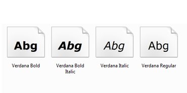
Ask most computer users what they think of the Verdana font and you’ll typically get a “meh” type response. The big daddy of fonts (or typefaces) is Helvetica – much loved by designers and until last week, it was the only typeface in the collection of the Museum of Modern Art in New York. Until now.
Last week MoMA announced it had acquired 23 digital typefaces for its Architecture and Design Collection and Verdana was one of them. Why? Well there is a lot more to Verdana than that meets the eye.
Verdana was specifically designed to be read on computer screens, unlike many typefaces which made the transition from paper to screen without change. Verdana is designed to be easily readable at small sizes and includes numerous other techniques that make it subtly brilliant as a screen fonts. The New York Times covered these techniques in detail, explaining how the number 1, and the letters I, i and l are all distinctly different. I’ll bet you can instantly tell each of them apart in the example below with Verdana on the left but less so with Times New Roman on the right.
There are crucial features designed in to Verdana such as counters (the negative space in letters) not getting filled in even when the font is bolded. Certain characters are designed to never touch another character, regardless of spacing (try f and i). You’d probably never notice this but when you print a document formatted with Verdana the letters are more widely spaces than on screen
Verdana is quietly versatile and wonderfully designed – all the more surprising to me then that the Design Museum in London doesn’t list it as one of the accomplishments of Matthew Carter. He designed the typeface for Microsoft and it arrived in to the world with Windows and Internet Explorer 3.0 – I love the Wikipedia entry that explains the etymology of the name and our own Microsoft Typography site explains the lineage and dateline of Verdana.
Can a typeface be art? Clearly.


