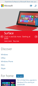
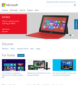
For a very long time, the acronym RWD signaled Rear Wheel Drive to me. That shows a misspent youth checking out the pages of AutoTrader for second hand cars but I’m an adaptable chap and now when I hear RWD I think Responsive Web Design. I’ve been hearing the term a lot of late from my friends in the Microsoft Design community and most recently seen it in action, and well documented, in relation to Microsoft.com
I’ll be honest, I haven’t always been a big fan of the corporate home page but in recent years it’s sharpened up its act. It helps that I sit right next to the team who design it so I get to see their comps and have a sense of how things are shaping up but it wasn’t until I stumbled across a Forbes.com post that I really paid attention. The post in question is titled Microsoft’s Site Redesign Will Introduce Mainstream Business To The Responsive Web where Anthony Wing Kosner noted
we find ourselves in this odd position where Microsoft is
actually more design-forward than Apple!
He was looking at a preview of the new Microsoft.com, resplendent with responsive web design. For those still dealing in the orientation of a vehicles drive, a RWD site is one that reconfigures itself dynamically to fit different size screens. In the world of mobile devices and screens of many sizes, that’s a big deal. You can learn more about RWD in the book of the same name from Ethan Marcotte.
As I dug some more in to this new world of web design I found another post titled The Story of the New Microsoft.com – a beautiful history of the birth of the new Microsoft.com by Nishant Kothary, a Web Strategist at Microsoft and another story by Paravel who helped work on the site.
The post by Nishant in particular is an excellent read with some great advice on topics as varied as interviewing, designing from the gut, leadership and building a bleeding edge site in the real world. For a website that is in the top 30 most visited in the world, ahead of Apple, Pinterest, Tumblr, Adobe, BBC, Flickr etc. that’s a big bold step. As Nishant notes, the Responsive movement rose from the proliferation of smartphones and tablets initially driven by Apple; ironically, even Apple.com is not responsive yet.
If you’ve not checked out the responsive web design of Microsoft.com in action, head to the URL from a mobile device and notice how it adapts to your devices. Nice eh?


